Using visual supports to communicate with neurodiverse individuals – for school, travel, or anything else – can be highly effective. According to the International Board of Certification and Continuing Education (ICBBES), visual support for people with developmental disorders “serves two main purposes: helping the child communicate with those around them, and aiding parents in communicating better with their child.”

Neurodivergent brain functioning impacts how a learner processes and retains information, and taking into consideration what’s effective for different but capable neurodiverse individuals can increase the accessibility of information.
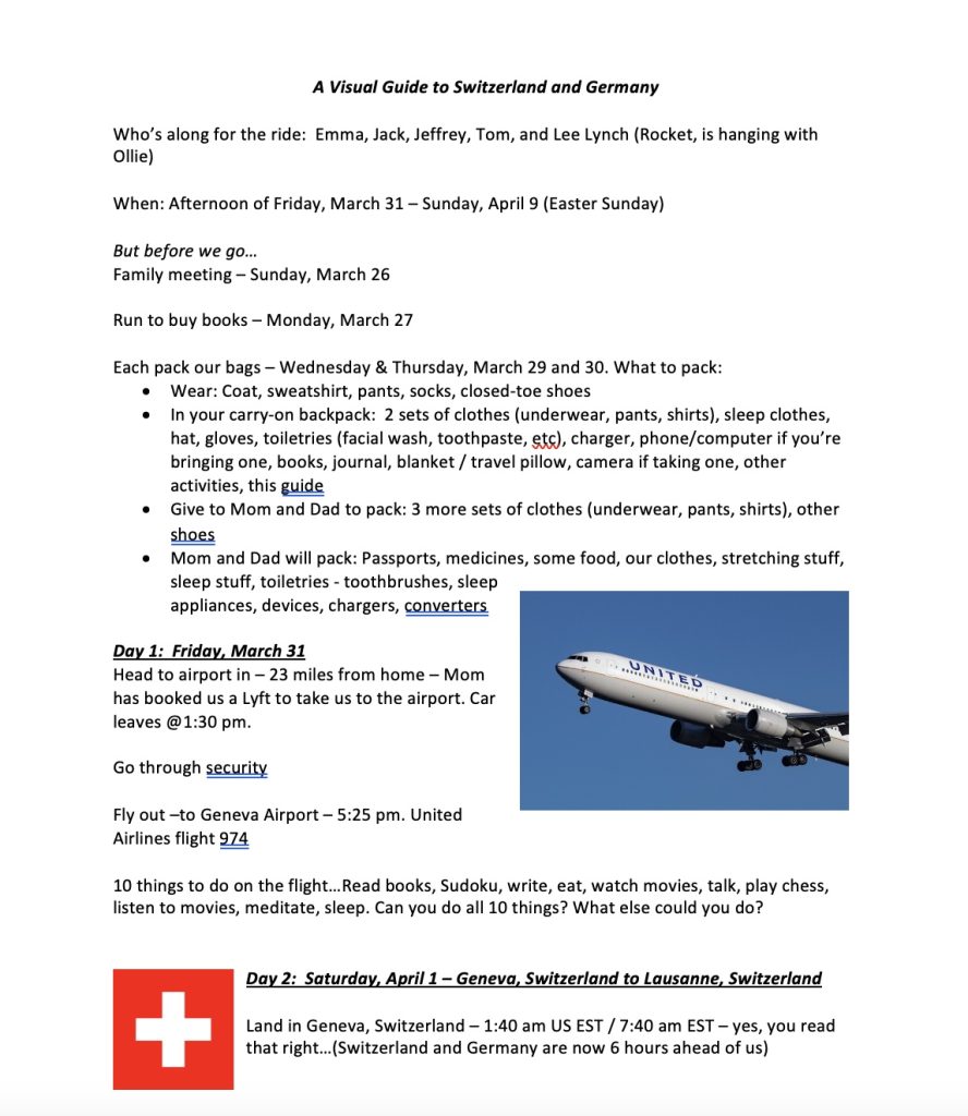
For a recent trip to Switzerland and Germany, I thought a visual guide would be a good way to preempt the anxieties of our younger neurodiverse travelers, so put one together to preview what was on the horizon for our family.

To create the guide, I spent a few hours researching things we could do at our planned destinations, then laying into a Word document a day-by-day description, with digital images and options of various possible adventures, of our upcoming trip.
It included where we would stay when, what we could see and eat, and how we would get from one city to another.

Once the draft guide was assembled, we walked through it during a family meeting about a week before our scheduled trip. The kids selected activities that appealed to them, and I reorganized the guide to reflect their feedback. Sample pages from our guide can be found here.

The exercise led me to wonder, what makes a visual guide for neurodiverse learners most effective? I investigated this topic and wanted to share what I found here, in case you ever have an inkling to put together this kind of guide for your neurodiverse loved ones.
15 tips for creating printed visual guides…

- Reinforce a base level of information by adding context, summarizing, or providing additional detail.
- Chunk content to prevent overload.
- Recap content to reinforce ideas.
- Pair pictures with captions.
- Share stories to explain ideas and applications and avoid jargon.
- Highlight important information, e.g., offset as larger and brighter.
- Explain what the reader can expect will happen after they have read the content.
- Consider incorporating game-like activities, e.g., a multiple-choice quiz at the conclusion of a section. However, activities involving sorting and reorganizing words can be challenging for people with ADHD, anxiety, and dyslexia.
- Provide positive feedback as to how a reader is progressing.
- For visuals – utilize consistent design elements and muted (rather than bright) colors.
- Utilize bullet points and brief sentences to enhance the processing of information.
- Consider using font size of at least 12-14 point, and possibly larger for dyslexic readers.
- Utilize larger-than-normal character spacing to enhance readability, e.g., 35% of average letter width.
- For headings use a font size that is larger than text size.
- Offset hyperlinks so they look different from other text.
Above all, seek to build a safe space that allows the reader to explore a topic and take chances that highlight progress rather than failure.
The resources below also provide guidance for building effective video, audio, and even environmental supports to maximize accessibility for neurodiverse individuals and are worth a read if this is an area of interest for you.
Our visual guide served our needs pretty well. Next time around, I’ll also add information to the guide about local transportation systems and options and will convene a family meeting each morning on our travels and use the guide to walk through our plans and options.
What guides or resources have you found useful? Share your guides with us – we’d love to see them!
Visual guide resources:

